Comparing Portfolios

After looking at several professional portfolios, I realized several differences that separate myself to a professional. The two portfolios I liked the most is Kuon Yagi and Ben Mingo. I chose these two portfolios for their stunning appearance and use of User Interface and User Experience. If you do not know what either of those is, please check out one of my previous blogs by clicking here.

Organization

The two professional portfolios are well organized into projects. Within each project are clean mockups that show their work along with a detailed description of the project. The organization in my portfolio could be better. For example, in my portfolio, there are several elements regarding the Trax app. It would be better to group it all in one post because they’re all from the same project.

Style

Both of the professional portfolios have their own styles which are carried out throughout the website and sometimes used in their projects as well! I do not have a certain style, unfortunately. I am hoping to find my style as I develop my skills as a designer. For now, I am leaning towards a minimalistic type of style with a mix of an illustrator style like Malika Favre. I find her work very interesting and unique.

Website

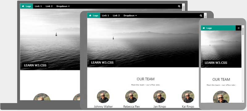
The User Experience (UX) and User Interface (UI) are very well designed in both portfolios. They are also VERY interactive in terms of hovering,  dragging and clicking causing cool animations to slide in with dramatic easing showing the projects they’ve worked on.

Given that my WordPress account was free, My website does not look as well as the professional ones. It would take money, which is something I do not have, to make a good lookin’ website. However, it is not all about the design of the website itself, instead, it should be about the quality of the work produced by the designer.

Overview

Overall, my is subpar compared to professional ones. However, one advantage I have over them is time.  With more time, I  have the opportunity to create more work than a professional. I hope to create an amazing portfolio with awesome work. Even though I am still unsure of what to focus on specifically (like logos, app designs, web design audio, animation etc.), I have enough time to figure out what I want to specify in.

Photo by Augustine Wong on Unsplash to see his cool pics.

Bootstrap CSS!

What is a bootstrap? A bootstrap is a line of code that makes the framework for websites easier for developers. They are also used as templates for typography, buttons, tables, navigations, models, and several other functions. This makes web development ten times easier than starting from scratch. Having a template gives the coder a head start in developing the website.

Bootstraps prevent repetition between projects, add consistency to design and code between projects and between developers, quickly and easily prototype new designs and ensures cross-browser compatibility. Browsers like Google Chrome, Mozilla Firefox, Internet Explorer, Edge, Safari, and Opera are all compatible with the bootstrap. This makes it the website available to more people.

Another advantage of bootstraps is that they are responsive. This means that they adjust to whatever device is being viewed on like smartphones, tablets, laptops, and desktops. This is vital to every website because without a responsive website the UX and UI between the product and the user would be a disaster. It would look unorganized as if someone copy and pasted oversized graphic elements.

img_temp_website

The image above shows an example of how a responsive website looks like. We have the Desktop, tablet, and mobile versions on the website adjusted by their dimension and resolution of the screen. As you can see the header is sized down according to the viewing device. It is also noticeable especially in the mobile version that the layout changed from profiles lined up horizontally versus in mobile where the profiles (circles) are lined up vertically.

One way to get bootstraps to create a website is through the website getbootstrap.com. This website allows any web developer to get a bootstrap to include in their work.  These shortcuts also have pre-styled components like dropdowns, button groups, navigation bar, breadcrumbs, labels, badges, alerts, progress bar, and several others.

Essentially, bootstraps are shortcuts of code in HTML and CSS; instead of typing fifteen lines of code, it could be shortened to three with the power of the bootstrap!

Why is Bootstrap so popular?

I believe bootstrap is popular because of the possibilities it is capable of. The templates Bootstrap provides can be altered to be one of a kind. Making a website could take only a matter of minutes, while at the same time visually look modern unlike former ways of building websites. Web Responsiveness is also another factor that makes web developing a lot easier which is why it is so popular.

Photo by David Rangel on Unsplash

Page Size Optimization

Page size optimization means boosting a website’s speed and performance to the max. So switching from “About Us” to “Home” button will take one fifteenth 1/15 of a second instead of fifteen seconds. Finding the problem is the first step of optimizing a website.

Most slow websites consist of:

  • Multiple CSS files
  • Scripts
  • Heavy images
  • Third-party plugins
  • Marketing tags
  • Tracking tags

Use the list above as things not to do when making a website. Be aware of the content in the website and make sure its short and on the point for whatever purpose the website may serve.

Next step is to optimize code in CSS and JavaScript (JS) to erase any extra lines or even shortcuts to make it easier for the computer to process and display in shorter time allowing for better performance for the website.

Gzip compression is a powerful tool that can guarantee any website better speed and performance overall. Gzip compression cuts down the size of the requested resource by almost 90%. This creates a ton of space to add in more elements to websites like more images, icons, text, buttons, graphics, and videos!

Almost nothing looks pretty without an image. recent studies show that page sizes consist of 64% on average. Most times, images are added in high quality to make a website have a crisp design. However, high quality images take a heavy toll and ultimately slow down page size optimization. Luckily, there is image compression to minimize the loading time of a website. Another great contribution is the metadata added when a picture is taken like the aperture, shutter speed, iso, and geo information which should be removed as well.

Browser caching is another technique to improve page size optimization. Using the cached data allows it to not need to redownload the resource again. It reduces the load server and allows more space for graphics and other elements.

Lastly, web fonts are used to minimize space held in the text. Unfortunately, some browsers do not support it web fonts.  Web fonts can be attained from external resources along with CSS and JavaScript. When using custom fonts, it is best to use it locally.

To learn more about web performance and page size optimization click here.

To learn more about more direct instructions to improving your website click here.

Photo by Kirstyn Paynter on Unsplash

Landing Pages: Tolerable vs. Terrible

After attempting to create a landing page on my own I learned several things. My text was oversized, as well as everything else: icons and graphics. Another flaw I was told by a very experienced designer suggested keeping my information to a minimum. The purpose is to download the app. It does not require a whole website based on the app.It is only a landing page!

If you are new to Adobe Muse or website making, in general, I recommend using a UI/ UX (user experience) template to get a sense of what sizes to make the font for desktop and scale down for tablet and mobile version.

It is important to make sure the user does not get distracted by the landing page. Too much information will result in a confused potential customer and maybe even lose the user from downloading the app. It is easy to mislead yourself from thinking your font is too small for the desktop version of the landing page. DONT MAKE IT BIGGER. Huge mistake buddy, Keep your font size under 60 unless you’re doing something design-wise.

Tolerable

Here is a list of qualities a landing page is recommended.

  • Functioning download buttons
  • Responsive web page (desktop, tablet, mobile)
  • Showcase application
  • 44pt to 18pt font from headings to paragraphs
  • Animations
  • Little text
  • Graphics
  • Joshua Tree (Contrast, Repetition, Alignment, Proximity)
  • Functioning Call to Action
  • Color scheme (Analogous, Complimentary,  Monochromatic)
  • Focuses on downloading app

Terrible

Here is a list of things you should not do in a landing page.

  • Make a whole website dedicated to the app
  • Unresponsive/ broken breakpoints
  • Oversized text
  • Too much test
  • Non-web responsive fonts (acts as an image)
  • Clutter of any kind
  • Broken Call to Action
  • Too many colors
  • Too much information
  • Poor use of Joshua Tree

Examples

View these sample landing pages by clicking this link here to get a better understanding of tolerable and terrible landing pages. Click here to see my own landing page for my Trax app.

Photo by Dan Gold on Unsplash

Bootstrap CSS

A bootstrap is a line of code that makes the framework for websites easier for developers. They are also used as templates for typography, buttons, tables, navigations, models, and several other functions. Bootstraps prevent repetition between projects, add consistency to design and code between projects and between developers, quickly and easily prototype new designs and ensures cross-browser compatibility. Another advantage of bootstraps is that they are responsive. This means that they adjust to whatever device is being viewed on like smartphones, tablets, laptops, and desktops. Ome way to get bootstraps to create a website is through the website getbootstrap.com. This website allows any web developer to get a bootstrap to include in their work.  These shortcuts also have pre-styled components like dropdowns, button groups, navigation bar, breadcrumbs, labels, badges, alerts, progress bar, and several others.

Essentially, bootstraps are shortcuts of code in HTML and CSS; instead of typing fifteen lines of code, it could be shortened to three with the power of the bootstrap! Here is an example of a bootstrap being used for accommodating to different electronic devices that are accessible to the internet.

When creating a page layout for websites it is essential to use the grid system which allows the creator to easily make a website with efficiency.

  • “Rows must be placed within a .container (fixed-width) or .container-fluid (full-width) for proper alignment and padding.
  • Use rows to create horizontal groups of columns.
  • Content should be placed within columns, and only columns may be immediate children of rows.
  • Predefined grid classes like .row and .col-xs-4 are available for quickly making grid layouts. Less mixins can also be used for more semantic layouts.
  • Columns create gutters (gaps between column content) via padding. That padding is offset in rows for the first and last column via negative margin on .rows.
  • The negative margin is why the examples below are outdented. It’s so that content within grid columns is lined up with non-grid content.
  • Grid columns are created by specifying the number of twelve available columns you wish to span. For example, three equal columns would use three .col-xs-4.
  • If more than 12 columns are placed within a single row, each group of extra columns will, as one unit, wrap onto a new line.
  • Grid classes apply to devices with screen widths greater than or equal to the breakpoint sizes, and override grid classes targeted at smaller devices. Therefore, e.g. applying any .col-md-* class to an element will not only affect its styling on medium devices but also on large devices if a .col-lg-* class is not present.”

These key points to starting a website are from the website itself that makes bootstraps, https://getbootstrap.com/docs/3.3/css/#overview.

Photo by Ryan Everett on Unsplash