Offline vs. Real-Time Video Editing

There are several types of video editing in the industry of today. In this blog, I will be talking about offline video editing and real-time video editing. How are these two types of video editing different? How are they used in the industry?

Offline Video Editing

Offline video editing is used to eliminate to lag caused high-quality footage when editing in Premiere or After Effects. This is done by compressing the videos to a lower resolution to make it easier for the computer to handle. Once the editing is done, the low-resolution footage is replaced with the raw footage and viola, efficiency over 9000!

This type of editing was used since the good ol’ days with film! As time passed, offline editing became popular because it was easier with the technology they had at the time. However, nowadays people do not often work ‘offline’. Technology greatly advanced over time, it is only used if the computer is not capable to handle raw footage.

In the industry, offline video editing is rarely used unless necessary. Due to advanced computer technology, offline editing is not necessary. However, it may possibly be used when raw footage is in 4K resolution.

Real-Time Video Editing

Real-time video editing is more common in the industry such as sports, music, and events. The best way to do this is with multiple cameras, to get the best shot of whatever it may be they are filming. For sports like hockey, multiple cameras are required to get the best quality. Still-shots work better for events like a piano concert and would only require one camera.

This type of video editing requires multiple CPU’s (computer processing unit), multiple gigabytes of RAM (random access memory) and high-powered hard drives. It is typically only professionally practiced. I believe it is very challenging because there is only one chance to get it right. However, to be efficient, camera work would be practiced to be precise and smooth.

How does this apply to me?

Personally, I will probably not use either form of video editing. This is because my computer has the power to render raw footage and I do not wish to pursue to be in the industry of live TV broadcasting. However, this is new knowledge to me and will one day serve to help me when I have a terrible computer or when I work with super duper high resolution! Thank you for reading my blog, and as always… let’s get this bread.

Photo by Jakob Owens on Unsplash

Bootstrap CSS!

What is a bootstrap? A bootstrap is a line of code that makes the framework for websites easier for developers. They are also used as templates for typography, buttons, tables, navigations, models, and several other functions. This makes web development ten times easier than starting from scratch. Having a template gives the coder a head start in developing the website.

Bootstraps prevent repetition between projects, add consistency to design and code between projects and between developers, quickly and easily prototype new designs and ensures cross-browser compatibility. Browsers like Google Chrome, Mozilla Firefox, Internet Explorer, Edge, Safari, and Opera are all compatible with the bootstrap. This makes it the website available to more people.

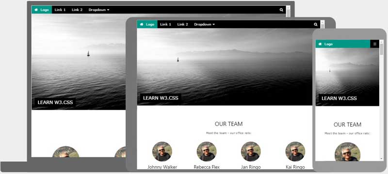
Another advantage of bootstraps is that they are responsive. This means that they adjust to whatever device is being viewed on like smartphones, tablets, laptops, and desktops. This is vital to every website because without a responsive website the UX and UI between the product and the user would be a disaster. It would look unorganized as if someone copy and pasted oversized graphic elements.

img_temp_website

The image above shows an example of how a responsive website looks like. We have the Desktop, tablet, and mobile versions on the website adjusted by their dimension and resolution of the screen. As you can see the header is sized down according to the viewing device. It is also noticeable especially in the mobile version that the layout changed from profiles lined up horizontally versus in mobile where the profiles (circles) are lined up vertically.

One way to get bootstraps to create a website is through the website getbootstrap.com. This website allows any web developer to get a bootstrap to include in their work.  These shortcuts also have pre-styled components like dropdowns, button groups, navigation bar, breadcrumbs, labels, badges, alerts, progress bar, and several others.

Essentially, bootstraps are shortcuts of code in HTML and CSS; instead of typing fifteen lines of code, it could be shortened to three with the power of the bootstrap!

Why is Bootstrap so popular?

I believe bootstrap is popular because of the possibilities it is capable of. The templates Bootstrap provides can be altered to be one of a kind. Making a website could take only a matter of minutes, while at the same time visually look modern unlike former ways of building websites. Web Responsiveness is also another factor that makes web developing a lot easier which is why it is so popular.

Photo by David Rangel on Unsplash

Format for Animated Web Banners

If you’re reading this you have probably seen a web banner. Maybe there’s one on this screen at this very moment. Try hovering over it. Does it have a loop if it is left untouched? Depending if it is a good web banner it would have a; seamless loop, hover animation, and a call to action. There are six things to take into consideration in making an animated web banner: responsiveness, animation, file size, design unity, simplicity, and eye-catching.

Responsiveness

Having a fully functional responsive web banner is very significant because it allows the potential customer to at least look at the web banner. Perfect responsiveness creates a professional look with out bothering the potential customers.

Animation

Never ever put too much animation in a web banner or else it will annoy the viewer of the website and (1.) drive the viewer off the website and most important (2.) not want the viewer to click on the web banner out of suspicion it will cause a virus or possibly because the web banner is terrible. Less is more; even a slight animation is enough to attract the viewer’s eyes to the ad.

File Size

Careful now, file size is super important. I doubt anyone is willing to wait for an ad to load unless you’re the creator of the web banner. File size should always be kept to a minimum so it loads on to the web page easily and rapidly. One way to do this is to keep your frame rate to 24. However, if your web banner does not have many elements it would be acceptable to use 29 FPS (frames per second) which is supported by Google.

Design Unity

The design of your web banner must be similar to the website or landing page in order to prevent confusion to the potential customer. If the design of the web banner does not match the website, then you’re a bad designer! Sorry to break it to you, it’s not variety that you want, it is the repetition of elements with the product and designs of all platforms. If you’re still confused, look up the Joshua Tree of Design.

Simplicity

The final design should be simple and not overcrowded. Too much information can be overwhelming to the viewer and will make it harder to pick out the purpose of the ad and what it is exactly.

Eye-Catching

Try making a web banner that is clever. Thoroughly think about your web banner. Plan out what kind of animations you want to use. Create a storyboard to help visualize the web banner.

To learn more click here

Photo by Serge Kutuzov on Unsplash

UI & UX

UI and UX elements are essential to a product and depend on each other. UX design leans towards the analytical and technical field while UI design relates to graphic design. However, the responsibilities of both UI and UX are complex.

To put it in a simpler way to understand, UX are the essential components in a tree like its cells and UI would represent the “design” of the plant (appearance). Its appearance correlates to its structure to get what it needs to survive like sunlight and water.

UX

To start off, UX stands for User Experience.  As stated in careerfoundry.com, the process of enhancing customer satisfaction and loyalty by improving the usability, ease of use, and pleasure provided in the interaction between the customer and the product.  UX design covers everything that is used on the customer’s en provided by the product. UX design is improved through research and continuous testing. UX’s responsibility can be divided into three categories according to careerfoundry’s: Strategy and Content, Wireframing and Prototyping, and Execution & Analytics. To get into further detail, here is a list of what each category consists of.

Strategy & Content

  • Competitor Analysis
  • Customer Analysis
  • Product Sttructure
  • Content Development

Wireframing &Prototyping

  • Wireframing
  • Prototyping
  • Testing/Iteration
  • Development Planning

Execution & Analytics

  • Coordination with UI Designers
  • Coordination with Developers
  • Tracking Goals and Integration
  • Analysis and Iteration

UI

UI stands for User Interface. Its purpose is to make it effective and pleasant to use. It is all about the look and feel. UI delves more into graphic design and interactivity with websites and apps and several other elements.

User Interface design is responsible for the transference of a product’s development, research, content, and layout into an attractive, guiding and responsive experience for users. According to my citations, UI can be divided into two categories: Design and Interactivity.

Design

The design aspect of UI involves customer analysis, design research, branding and graphic development, and most importantly a storyline. Customer analysis allows the graphic developer to fix whatever is necessary to achieve an efficient product while design research is done to find what sort of style should be considered in making the product. The storyline is the plan of attack when it comes to designing and branding the product.

Interactivity

The interactive responsibility is very important because even though it may look pretty, it will not work. Interactivity consists of: animation, web responsiveness, and prototyping.

A wise man once said, “A great product experience starts with UX followed by UI.”

If you want to learn more about UI click here.

If you would like to expand your knowledge on  UI click here.

Photo by Nic Low on Unsplash

Page Size Optimization

Page size optimization means boosting a website’s speed and performance to the max. So switching from “About Us” to “Home” button will take one fifteenth 1/15 of a second instead of fifteen seconds. Finding the problem is the first step of optimizing a website.

Most slow websites consist of:

  • Multiple CSS files
  • Scripts
  • Heavy images
  • Third-party plugins
  • Marketing tags
  • Tracking tags

Use the list above as things not to do when making a website. Be aware of the content in the website and make sure its short and on the point for whatever purpose the website may serve.

Next step is to optimize code in CSS and JavaScript (JS) to erase any extra lines or even shortcuts to make it easier for the computer to process and display in shorter time allowing for better performance for the website.

Gzip compression is a powerful tool that can guarantee any website better speed and performance overall. Gzip compression cuts down the size of the requested resource by almost 90%. This creates a ton of space to add in more elements to websites like more images, icons, text, buttons, graphics, and videos!

Almost nothing looks pretty without an image. recent studies show that page sizes consist of 64% on average. Most times, images are added in high quality to make a website have a crisp design. However, high quality images take a heavy toll and ultimately slow down page size optimization. Luckily, there is image compression to minimize the loading time of a website. Another great contribution is the metadata added when a picture is taken like the aperture, shutter speed, iso, and geo information which should be removed as well.

Browser caching is another technique to improve page size optimization. Using the cached data allows it to not need to redownload the resource again. It reduces the load server and allows more space for graphics and other elements.

Lastly, web fonts are used to minimize space held in the text. Unfortunately, some browsers do not support it web fonts.  Web fonts can be attained from external resources along with CSS and JavaScript. When using custom fonts, it is best to use it locally.

To learn more about web performance and page size optimization click here.

To learn more about more direct instructions to improving your website click here.

Photo by Kirstyn Paynter on Unsplash

Landing Pages: Tolerable vs. Terrible

After attempting to create a landing page on my own I learned several things. My text was oversized, as well as everything else: icons and graphics. Another flaw I was told by a very experienced designer suggested keeping my information to a minimum. The purpose is to download the app. It does not require a whole website based on the app.It is only a landing page!

If you are new to Adobe Muse or website making, in general, I recommend using a UI/ UX (user experience) template to get a sense of what sizes to make the font for desktop and scale down for tablet and mobile version.

It is important to make sure the user does not get distracted by the landing page. Too much information will result in a confused potential customer and maybe even lose the user from downloading the app. It is easy to mislead yourself from thinking your font is too small for the desktop version of the landing page. DONT MAKE IT BIGGER. Huge mistake buddy, Keep your font size under 60 unless you’re doing something design-wise.

Tolerable

Here is a list of qualities a landing page is recommended.

  • Functioning download buttons
  • Responsive web page (desktop, tablet, mobile)
  • Showcase application
  • 44pt to 18pt font from headings to paragraphs
  • Animations
  • Little text
  • Graphics
  • Joshua Tree (Contrast, Repetition, Alignment, Proximity)
  • Functioning Call to Action
  • Color scheme (Analogous, Complimentary,  Monochromatic)
  • Focuses on downloading app

Terrible

Here is a list of things you should not do in a landing page.

  • Make a whole website dedicated to the app
  • Unresponsive/ broken breakpoints
  • Oversized text
  • Too much test
  • Non-web responsive fonts (acts as an image)
  • Clutter of any kind
  • Broken Call to Action
  • Too many colors
  • Too much information
  • Poor use of Joshua Tree

Examples

View these sample landing pages by clicking this link here to get a better understanding of tolerable and terrible landing pages. Click here to see my own landing page for my Trax app.

Photo by Dan Gold on Unsplash

Bootstrap CSS

A bootstrap is a line of code that makes the framework for websites easier for developers. They are also used as templates for typography, buttons, tables, navigations, models, and several other functions. Bootstraps prevent repetition between projects, add consistency to design and code between projects and between developers, quickly and easily prototype new designs and ensures cross-browser compatibility. Another advantage of bootstraps is that they are responsive. This means that they adjust to whatever device is being viewed on like smartphones, tablets, laptops, and desktops. Ome way to get bootstraps to create a website is through the website getbootstrap.com. This website allows any web developer to get a bootstrap to include in their work.  These shortcuts also have pre-styled components like dropdowns, button groups, navigation bar, breadcrumbs, labels, badges, alerts, progress bar, and several others.

Essentially, bootstraps are shortcuts of code in HTML and CSS; instead of typing fifteen lines of code, it could be shortened to three with the power of the bootstrap! Here is an example of a bootstrap being used for accommodating to different electronic devices that are accessible to the internet.

When creating a page layout for websites it is essential to use the grid system which allows the creator to easily make a website with efficiency.

  • “Rows must be placed within a .container (fixed-width) or .container-fluid (full-width) for proper alignment and padding.
  • Use rows to create horizontal groups of columns.
  • Content should be placed within columns, and only columns may be immediate children of rows.
  • Predefined grid classes like .row and .col-xs-4 are available for quickly making grid layouts. Less mixins can also be used for more semantic layouts.
  • Columns create gutters (gaps between column content) via padding. That padding is offset in rows for the first and last column via negative margin on .rows.
  • The negative margin is why the examples below are outdented. It’s so that content within grid columns is lined up with non-grid content.
  • Grid columns are created by specifying the number of twelve available columns you wish to span. For example, three equal columns would use three .col-xs-4.
  • If more than 12 columns are placed within a single row, each group of extra columns will, as one unit, wrap onto a new line.
  • Grid classes apply to devices with screen widths greater than or equal to the breakpoint sizes, and override grid classes targeted at smaller devices. Therefore, e.g. applying any .col-md-* class to an element will not only affect its styling on medium devices but also on large devices if a .col-lg-* class is not present.”

These key points to starting a website are from the website itself that makes bootstraps, https://getbootstrap.com/docs/3.3/css/#overview.

Photo by Ryan Everett on Unsplash

Web Safe Colors

Web safe colors are colors that are supported by a majority of web browsers and virtually any operating system back when computers could only handle 256 colors. However only 216 colors out of the 256 were constant enough to be considered to as “web safe”.

  Nowadays, we don’t have to worry about using web safe colors because of how technology has greatly advanced. Monitors now support millions of colors. There may be a slight difference in color depending on what operating system and software is being used to display all the wonderful vibrant colors.

  CSS and HTML formats specifically allow for over sixteen million colors to be displayed without any distortion of lightness, saturation, or hue of the color. To break it down further the colors support 256 shades of red, 256 shades of green, 256 shades of blue, when combines make exactly 16,777,216.

  Most designers of web determine colors by hex codes. Hexadecimal notation is a six digit/alphabetical code that when is typed in Adobe software produces a specific color. For example, the hexadecimal notation for magenta is #ff0ff. Or if you want a darker shade of magenta just type in the code #8b008b. Another helpful guide to finding the perfect color is RGB notation. This method functions by adding and/or removing the colors red, green, and blue. Adding all the colors (each 255 shades of RGB) create white because they’re additive colors. An example of RGB notation is if you want to create a pastel lavender. Simply type in the notation R: 216 G:205 B:255.

  To pick a website’s color is very challenging. Instead, search for color picker in Google and several pretty color combinations will show up and help you decide which color suits best for your website. Color schemes like monochromatic, analogous, and complimentary colors are typical ways for picking colors for any website.

Web safe colors don’t really apply nowadays but as always, can still be displayed in monitors. But now, the world is unlimited to any color pallet ever. Web safe colors can be applied in Photoshop simply by clicking the “Web Safe Color” check box.

Colors can change on what kind of brand you have. The red on a Windows monitor is different on a Macintosh monitor. *cough cough* (Macs suck)

To play around with RGB notation click here

To find the exact hexadecimal code for your website click here

To learn more about web safe colors, hex codes, RGB notation, and a whole lot of other stuff click here

Photo by Thomas Charters on Unsplash

RGB vs. CMYK

These are color modes that determine whether you are either printing or posting an image on the web.

RGB

Red Green Blue, is what RGB stands for. This mode made for web images. Since web images are displayed in computer monitors, they allow a million more colors than what printing can do. This color mode involves additive colors, which means to make a certain color you have to add some red and some green and maybe a little blue to get your favorite color.  According to Michele Allen, the human eye cannot see reflected light, therefore homosapiens sapiens can only see black. However, if all the colors of the CMYK colored are removed, then humans are able to see the RGB colors.

CMYK

This color is also known as Cyan, Magenta, Yellow and Key. Key is black ink and is called key because in four color printing, the rest of the colors’ (cyan, magenta, yellow) printing plates are carefully aligned with the key of the black plate. What is meant by plates is that each color has a plate of the image being printed. Therefore with each plate, laid on top of each other, would create the perfectly colored picture. This color mode is subtractive, meaning that if cyan, magenta, yellow and black, were removed it would create white. CMYK color mode should always be used for printing anything! If you were to look at a print with a magnified glass, the printing colors will show as tiny organized dots overlapping each other to make a certain color. These are screens of each color that overlap to make certain colors.

CMYK-Image-3

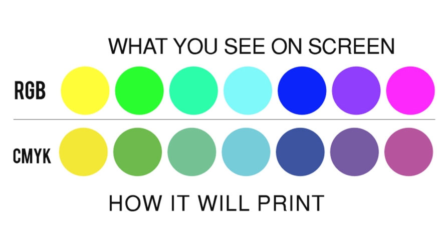
This is a very important diagram of how CMYK messes up colors. It is not made to print such neon colors like these. However, with PMS printing you can make all kinds of colors like neons and metallic colors! Unfortunately it is very expensive and almost no one uses it unless they’re extraordinarily rich.

Pro Tip: Always know whether you’re using CMYK or RGB because if you switch in between while working it will most definitely eff up all your colors and that nice red sweater will turn into a poopy brown. ): I know this by experience, so please, stick to one and just make two separate files (one for RGB and the other for CMYK)

To see who took this beautiful featured image click here

To play around CMYK colors click here

Photo by Felix Dubois-Robert on Unsplash

Raster vs. Vectors

Raster

Raster images are made of millions of pixels. An image can be identified as a raster image if you zoom in enough to where tiny squares (pixels) are visible. Using raster images are most useful when editing images. This is a because vectors can not be touched up to make a better quality image. Smoothed edges and transitions between colors make raster images look better compared to a vector image. Raster images are also used for websites to showcase whatever purpose they are trying to achieve.  When painting with pixels, it gives a feathered transition from the foreground to the background. If a gradient of the all the colors were to be made with no vectors, it would look like a rainbow. However if a gradient were to be made with all the colors with vectors, it would look like stripes of colors like the ten year old colored a rainbow with no blending.

  Overall,  raster images are meant for editing photographs, drawing or painting on Adobe Photoshop, and for using effects to perfect images with even the smallest details.

Vector

Vectors are created with paths. Paths are curves and lines that form whatever shape or design is being created. The outlook of a vectorized painting for example would look like a simplified version because it what happens during the process is that the software recognizes all the color and creates a shape for each of them. Therefore, it would have hard edges between colors unlike an original painting were colors are smoothly blended in. Software like Adobe Illustrator are specifically created to create vectors. Adobe Photoshop also creates vectors. However, Photoshop is not as versatile as Illustrator. Vectors and paths use algorithmic curvatures and does not depend on resolution. Vector shapes can be resized from the size of a coin to a billboard without showing any kind of pixel problem. Compared to rasterized images, vectors are efficient in saving space because it uses formulas to save the file instead of pixels like rasterized images.

  Designs like logos should always be created with vectors. This is because you never know  when you need to resize your logo for a flyer, a website, business card, a poster, or even a billboard! If you try to size up or expand a logo that is rasterized it will come out pixelated with a very low resolution.

Photo by Ari He on Unsplash