Bootstrap CSS!

What is a bootstrap? A bootstrap is a line of code that makes the framework for websites easier for developers. They are also used as templates for typography, buttons, tables, navigations, models, and several other functions. This makes web development ten times easier than starting from scratch. Having a template gives the coder a head start in developing the website.

Bootstraps prevent repetition between projects, add consistency to design and code between projects and between developers, quickly and easily prototype new designs and ensures cross-browser compatibility. Browsers like Google Chrome, Mozilla Firefox, Internet Explorer, Edge, Safari, and Opera are all compatible with the bootstrap. This makes it the website available to more people.

Another advantage of bootstraps is that they are responsive. This means that they adjust to whatever device is being viewed on like smartphones, tablets, laptops, and desktops. This is vital to every website because without a responsive website the UX and UI between the product and the user would be a disaster. It would look unorganized as if someone copy and pasted oversized graphic elements.

img_temp_website

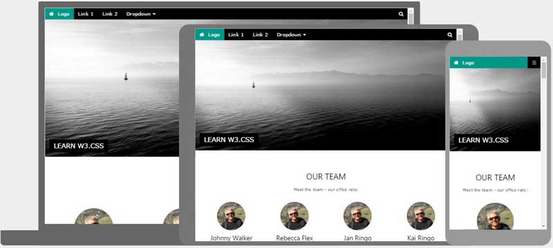
The image above shows an example of how a responsive website looks like. We have the Desktop, tablet, and mobile versions on the website adjusted by their dimension and resolution of the screen. As you can see the header is sized down according to the viewing device. It is also noticeable especially in the mobile version that the layout changed from profiles lined up horizontally versus in mobile where the profiles (circles) are lined up vertically.

One way to get bootstraps to create a website is through the website getbootstrap.com. This website allows any web developer to get a bootstrap to include in their work.  These shortcuts also have pre-styled components like dropdowns, button groups, navigation bar, breadcrumbs, labels, badges, alerts, progress bar, and several others.

Essentially, bootstraps are shortcuts of code in HTML and CSS; instead of typing fifteen lines of code, it could be shortened to three with the power of the bootstrap!

Why is Bootstrap so popular?

I believe bootstrap is popular because of the possibilities it is capable of. The templates Bootstrap provides can be altered to be one of a kind. Making a website could take only a matter of minutes, while at the same time visually look modern unlike former ways of building websites. Web Responsiveness is also another factor that makes web developing a lot easier which is why it is so popular.

Photo by David Rangel on Unsplash

Format for Animated Web Banners

If you’re reading this you have probably seen a web banner. Maybe there’s one on this screen at this very moment. Try hovering over it. Does it have a loop if it is left untouched? Depending if it is a good web banner it would have a; seamless loop, hover animation, and a call to action. There are six things to take into consideration in making an animated web banner: responsiveness, animation, file size, design unity, simplicity, and eye-catching.

Responsiveness

Having a fully functional responsive web banner is very significant because it allows the potential customer to at least look at the web banner. Perfect responsiveness creates a professional look with out bothering the potential customers.

Animation

Never ever put too much animation in a web banner or else it will annoy the viewer of the website and (1.) drive the viewer off the website and most important (2.) not want the viewer to click on the web banner out of suspicion it will cause a virus or possibly because the web banner is terrible. Less is more; even a slight animation is enough to attract the viewer’s eyes to the ad.

File Size

Careful now, file size is super important. I doubt anyone is willing to wait for an ad to load unless you’re the creator of the web banner. File size should always be kept to a minimum so it loads on to the web page easily and rapidly. One way to do this is to keep your frame rate to 24. However, if your web banner does not have many elements it would be acceptable to use 29 FPS (frames per second) which is supported by Google.

Design Unity

The design of your web banner must be similar to the website or landing page in order to prevent confusion to the potential customer. If the design of the web banner does not match the website, then you’re a bad designer! Sorry to break it to you, it’s not variety that you want, it is the repetition of elements with the product and designs of all platforms. If you’re still confused, look up the Joshua Tree of Design.

Simplicity

The final design should be simple and not overcrowded. Too much information can be overwhelming to the viewer and will make it harder to pick out the purpose of the ad and what it is exactly.

Eye-Catching

Try making a web banner that is clever. Thoroughly think about your web banner. Plan out what kind of animations you want to use. Create a storyboard to help visualize the web banner.

To learn more click here

Photo by Serge Kutuzov on Unsplash

Landing Pages: Tolerable vs. Terrible

After attempting to create a landing page on my own I learned several things. My text was oversized, as well as everything else: icons and graphics. Another flaw I was told by a very experienced designer suggested keeping my information to a minimum. The purpose is to download the app. It does not require a whole website based on the app.It is only a landing page!

If you are new to Adobe Muse or website making, in general, I recommend using a UI/ UX (user experience) template to get a sense of what sizes to make the font for desktop and scale down for tablet and mobile version.

It is important to make sure the user does not get distracted by the landing page. Too much information will result in a confused potential customer and maybe even lose the user from downloading the app. It is easy to mislead yourself from thinking your font is too small for the desktop version of the landing page. DONT MAKE IT BIGGER. Huge mistake buddy, Keep your font size under 60 unless you’re doing something design-wise.

Tolerable

Here is a list of qualities a landing page is recommended.

  • Functioning download buttons
  • Responsive web page (desktop, tablet, mobile)
  • Showcase application
  • 44pt to 18pt font from headings to paragraphs
  • Animations
  • Little text
  • Graphics
  • Joshua Tree (Contrast, Repetition, Alignment, Proximity)
  • Functioning Call to Action
  • Color scheme (Analogous, Complimentary,  Monochromatic)
  • Focuses on downloading app

Terrible

Here is a list of things you should not do in a landing page.

  • Make a whole website dedicated to the app
  • Unresponsive/ broken breakpoints
  • Oversized text
  • Too much test
  • Non-web responsive fonts (acts as an image)
  • Clutter of any kind
  • Broken Call to Action
  • Too many colors
  • Too much information
  • Poor use of Joshua Tree

Examples

View these sample landing pages by clicking this link here to get a better understanding of tolerable and terrible landing pages. Click here to see my own landing page for my Trax app.

Photo by Dan Gold on Unsplash

RGB vs. CMYK

These are color modes that determine whether you are either printing or posting an image on the web.

RGB

Red Green Blue, is what RGB stands for. This mode made for web images. Since web images are displayed in computer monitors, they allow a million more colors than what printing can do. This color mode involves additive colors, which means to make a certain color you have to add some red and some green and maybe a little blue to get your favorite color.  According to Michele Allen, the human eye cannot see reflected light, therefore homosapiens sapiens can only see black. However, if all the colors of the CMYK colored are removed, then humans are able to see the RGB colors.

CMYK

This color is also known as Cyan, Magenta, Yellow and Key. Key is black ink and is called key because in four color printing, the rest of the colors’ (cyan, magenta, yellow) printing plates are carefully aligned with the key of the black plate. What is meant by plates is that each color has a plate of the image being printed. Therefore with each plate, laid on top of each other, would create the perfectly colored picture. This color mode is subtractive, meaning that if cyan, magenta, yellow and black, were removed it would create white. CMYK color mode should always be used for printing anything! If you were to look at a print with a magnified glass, the printing colors will show as tiny organized dots overlapping each other to make a certain color. These are screens of each color that overlap to make certain colors.

CMYK-Image-3

This is a very important diagram of how CMYK messes up colors. It is not made to print such neon colors like these. However, with PMS printing you can make all kinds of colors like neons and metallic colors! Unfortunately it is very expensive and almost no one uses it unless they’re extraordinarily rich.

Pro Tip: Always know whether you’re using CMYK or RGB because if you switch in between while working it will most definitely eff up all your colors and that nice red sweater will turn into a poopy brown. ): I know this by experience, so please, stick to one and just make two separate files (one for RGB and the other for CMYK)

To see who took this beautiful featured image click here

To play around CMYK colors click here

Photo by Felix Dubois-Robert on Unsplash

Raster vs. Vectors

Raster

Raster images are made of millions of pixels. An image can be identified as a raster image if you zoom in enough to where tiny squares (pixels) are visible. Using raster images are most useful when editing images. This is a because vectors can not be touched up to make a better quality image. Smoothed edges and transitions between colors make raster images look better compared to a vector image. Raster images are also used for websites to showcase whatever purpose they are trying to achieve.  When painting with pixels, it gives a feathered transition from the foreground to the background. If a gradient of the all the colors were to be made with no vectors, it would look like a rainbow. However if a gradient were to be made with all the colors with vectors, it would look like stripes of colors like the ten year old colored a rainbow with no blending.

  Overall,  raster images are meant for editing photographs, drawing or painting on Adobe Photoshop, and for using effects to perfect images with even the smallest details.

Vector

Vectors are created with paths. Paths are curves and lines that form whatever shape or design is being created. The outlook of a vectorized painting for example would look like a simplified version because it what happens during the process is that the software recognizes all the color and creates a shape for each of them. Therefore, it would have hard edges between colors unlike an original painting were colors are smoothly blended in. Software like Adobe Illustrator are specifically created to create vectors. Adobe Photoshop also creates vectors. However, Photoshop is not as versatile as Illustrator. Vectors and paths use algorithmic curvatures and does not depend on resolution. Vector shapes can be resized from the size of a coin to a billboard without showing any kind of pixel problem. Compared to rasterized images, vectors are efficient in saving space because it uses formulas to save the file instead of pixels like rasterized images.

  Designs like logos should always be created with vectors. This is because you never know  when you need to resize your logo for a flyer, a website, business card, a poster, or even a billboard! If you try to size up or expand a logo that is rasterized it will come out pixelated with a very low resolution.

Photo by Ari He on Unsplash

Destructive and Non-Destructive Operations

When working in Photoshop, there are two ways of fixing an image: Destructive and non- destructive.

Destructive Editing

Destructive editing pertains to the pixels in an image or photograph are altered. It is called “destructive” because the original state of the pixels are considered destroyed. For example: Using a soft- healing brush on a model’s face in the photograph would be considered as destructive editing. When you use this tool you are taking pixels from another area of the model’s skin that has consistency, it digitally manipulates each individual pixel that is selected to fix the any blemishes on the model. Ultimately, the finished result of using destructive editing usually improves the image.

Long ago, destructive editing was the only way to edit digital photos.  Adobe Photoshop is considered destructive editing software. However, if you have the intellectual capacity to expand your knowledge on Photoshop, then editing photos can be edited non- destructively.

Non- Destructive Editing

This type of editing allows the designer to adjust and manipulate and image without messing with the original photograph. There are several techniques to using non-destructive methods like adjustment layers, smart filters, and a multitude of other methods.

  Using adjustment layers allows to add color without altering any pixels from the original pictures. To access adjustment layers in Photoshop click Choose Layer> New Adjustment Layer and choose and option. Transforming with Smart Objects in Photoshop allow the image to be warped, skewed, rotated, and scaled with out any pixels being broken. Images that aren’t smart objects already can be converted by clicking Layer> Smart Objects> Convert To Smart Objects.Most casual designers fail to crop non-destructively. It can be easily achieved by selecting Hide from the options bar to hold the cropped area in a layer. To adjust it, click Image>Reveal All or by dragging the crop tool past the edge of the image. One of the easiest ways to work non- destructively is by simply adding another layer to retouch certain inconsistencies will help not damage the original image; specifically, this can used for tools like healing brush, spot- healing brush, and clone stamp. Lastly, masks are used non-destructively to hide and reveal certain adjustments made to an image without damaging any pixels. To do this you can make a group with a layer mask and with the brush tool you can select which parts you want to hide.

Photo by Peter Clarkson on Unsplash

72dpi vs. 300dpi

After a few guesses of attempting to guess what dpi stands for I’ve concluded that it is an abbreviation for Dog Pee Incidents. However, the intellectual internet has yet again taught me something new; Dpi stands for dots per inch.

What’s Dpi?

Dots per inch refers to the print on posters, banners, and several other printable objects that use dots of ink per inch to determine the quality of a printed image. In simpler terms, the higher the dpi the more detail would show in the finished printed product.

DPIs used for Printing and Web

The DPI may have to be altered depending on how the designer will exhibit his or her work. If the designer chooses to print their work, they must use a DPI of at least one hundred and fifty (typically three hundred.) It is important to have a  high dpi otherwise suffering of one’s self is guaranteed due to the poor quality If the designer chooses it to add their image on a blog it would be ideal to use a DPI of 72.  This is because it is considered the standard dpi for web images.

  Resolution also plays a great factor in images because if an image is taken in with a low resolution (like a flip phone or an old android tablet) then no matter what dpi the image is set to; it will come out in bad quality. In order to avoid that situation, designers should use only the most advanced camera for professionals, DSLR cameras. A DSLR’s resolution can go up to 50.6 megapixels for each photograph.

  Another important factor is the size of the computer’s monitor that any designer is  working on — which can alter the dpi of the image. For example, a monitor with the resolution of 1024×768 will have a dpi of 70. While in a monitor with a resolution of 1280×1024 would have a dpi of 87. This would result with a smaller image but with greater detail because of the density of pixels on the monitor or PPI (also known as Pixels per Inch.)

Later on in our multimedia class, we will have to know by prior knowledge when to use which types of DPIs which makes all of us just a little bit better.

To further comprehend the meaning and uses of DPI click here.

To explore more awesome pictures of this photographer seen in the featured image click here


File Types

EPS

This file format is used in vector based images in Adobe Illustrator. EPS stands for Encapsulated Post Script. Its purpose is specifically to open in Adobe Illustrator which contains text and graphics.

PDF

Portable Document Format file, (also known as PDF) is usually used for saving documents like fill- out forms online. Fortunately, it can be viewed on multiple programs and software. This includes: Google Chrome, Bing, Adobe Acrobat Reader, and Firefox. However, it can only  be edited in Adobe Acrobat Reader.

TIFF

TIFF, meaning Tag Imagine File Format, is responsible for switching raster graphics images back and forth through application programs. TIFFs are commonly used in faxing, medical imaging, 3D application, and desktop publishing.

JPEG

JPEG is a common file extension to save images. If a PNG file with transparency were to be saved as a JPEG, the transparency would not be recognized and would be replaced into white.

PNG

The file format extension, Portable Network Graphics, is designed specifically for network image data transmission and storage. Nowadays, PNGs are used to replace GIFs. GIFs show animations like a stick man doing the macarena.

Image result for macarena gif

ASCII

 ASCII is synonymous to the file format extension, .txt. Its purpose is to show text that can be used in any word processor or text editor.

MPEG

Moving Picture Experts Group is the extension of MPEG. As the name suggests, it is a video file that is compressed (to occupy less space in bytes.) Since it doesn’t take up as much space, it is used for downloading and streaming movies.

MIDI

MIDI is used for professional audio for making music that is supported by computer sound cards. MIDI is specifically used to add synthesizers to control: note- ons, note- offs, tempo, pitch, and voice of a song. However, technically there are limited options when it comes to adding a synth to a song. One advantage is that it it compressed to a very small file size. MIDI stands for Musical Instrument Digital Interface.

AV

AV is an Audio Visual Document file. It can also be recognized as .XAV or .XAVT. This file format is used to contain the script.  It makes the process of adding dialogue, scenes, character info, actions, emotions, and acting tips that are necessary for a script. Accessing AV files is easy; All you have to do is open it in Notepad provided by both Macs and Windows or by Final Draft AV software.

WAV

Waveform Audio Format is considered a raw audio format. Depending on what type of music is being recorded, WAV formats are more often used for non- digital music. One disadvantage is that it is uncompressed, meaning it is not sized down to a smaller size (in bytes.)

Photo by Hanny Naibaho on Unsplash

Multimedia Jobs

Multimedia Designer

As an undergraduate it would be very difficult to get a spot as a multimedia designer. If anyone with no experience were to apply for a company they would have to work there way to the top. From washing toilets to being CEO of the most successful company. Being a multimedia designer requires a very creative mind along with the knowledge of using several adobe applications. Other skills like communication skills and an understanding of modern trends is very important to attain in order to convince the customer to purchase your design. Depending on whether you take the job part time or full time, the average annual salary is between $35,000 and $45,000.

Web Designer

To be a web designer, an associate’s degree is required at least with several key skills. Communication, graphic design, and teamwork are one of the many key skills in order to suffice as a web designer. As a part of the job, web designers must effectively produce an attractive appearance, layout and features of a website. Responsibilities include: writing and editing content, designing webpage layout, updating websites and backing up files. According to the U.S Bureau Statistics, the annual salary was $46,900 in 2015 and projected to grow by 1% between 2014 and 2014.

Brand Identity Designer

A Brand Identity Designer creates the look for the whole business. This varies from business cards to media advertising. The requirements to becoming a Brand Identity Designer are a master’s degree, job experiences of leadership, knowledge of business and marketing.Being a Brand Identity Designer needs a lot of dedication because they are in charge of every design produced for the company and has a great influence in the business’ outlook. Annual salary is about $46,900 according to the Bureau of Labor Statistics and just like Web Designers, it is projected to grow by 1% by 2014.

Flash Designer

Adobe Flash is a program that uses vectors and raster graphics which allow websites to be interactive and/ or animated. Since there are several fields of flash designers the annual salary is between $30,000 and $81,000! It is also predicted that the job growth will increase by 27%. Being a certified Flash designer along with an excellent portfolio of previous works on Adobe Flash is the best way to pursue a career in this field and ensure clients with a sense of professionalism

Creative/ Art Director

Creative Directors are the leaders that do advertising and marketing businesses. Directors work cooperatively with designers, artists, copywriters, and sales teams to create an amazing product. The Bureau of labor Statistics state that the median annual income for creative directors is $108,260. To reach this high of a job position, one must have several years of experience, analytical skills, decision making skilles, interpersonal and management skills.

Photo by Jordan Whitfield on Unsplash

Multimedia Presentations

Sometimes a student’s presentation is mundane and sleep-inducing. Students should be taught how to present and use the tools of technology to enhance anyone’s presentation. Multimedia presentations include animations, sound clips, or/ and videos. Using other kinds of media will enhance a presentation enough to make it actually interesting. Interesting presentations would increase the audience’s attention span and result in a better comprehension for the viewers. Here are ___ ways to enhance a presentation.

1. Background Music

As a part of sound, background music provides a less awkward presence when you’re caught in a thought. Background music will entice the audience and catch their attention right at the beginning of your presentation. The challenge is to keep an audiences’ attention and not bore them to death.

2.Sound Effects

Sound effects can further enhance a presentation and can possibly provide an sense of comic relief instead of acting serious the whole time. Make sure you choose your sound when, what, and how loud wisely because it can overwhelm the audience and become annoying. In other words, try not to us too much of anything.

3.Use Videos

Videos can recapture the audiences attention when they’ve become bored. The cause of this is usually that the presenter is talking too much. Videos can also develop a better understanding for the audience by providing an outside source and another way of explaining whatever information is being explained.

4.Animations

Animations are effects that are added to text to enhance a presentation. This would make it less dull. A tip for animations is to ensure to each effect is short and quick. As long as the animation is not hindering your presentation or slowing you down, then it would be okay. An example of this is the animation effect “Flip” or “Whip” where each letter drops down one by one. It can take almost a minute and a half  for all the info to show just for that slide. By the time the presenter runs out of things to say, he/ she has to wait for the animation to finish.

5.Transitions

Transitions are like animations but instead, they are used to transition between different subjects or topics of information. An example of this is when the presenter is changing slides in PowerPoint or Google slides. Transitions allow the presentation to flow smoothly and efficiently. Using transitions provide a more sophisticated and professional presentation.

Photo by nick hidalgo on Unsplash